Disk Space Analyzer Max Online Tutorial
Introduction to the Layout of the Tool
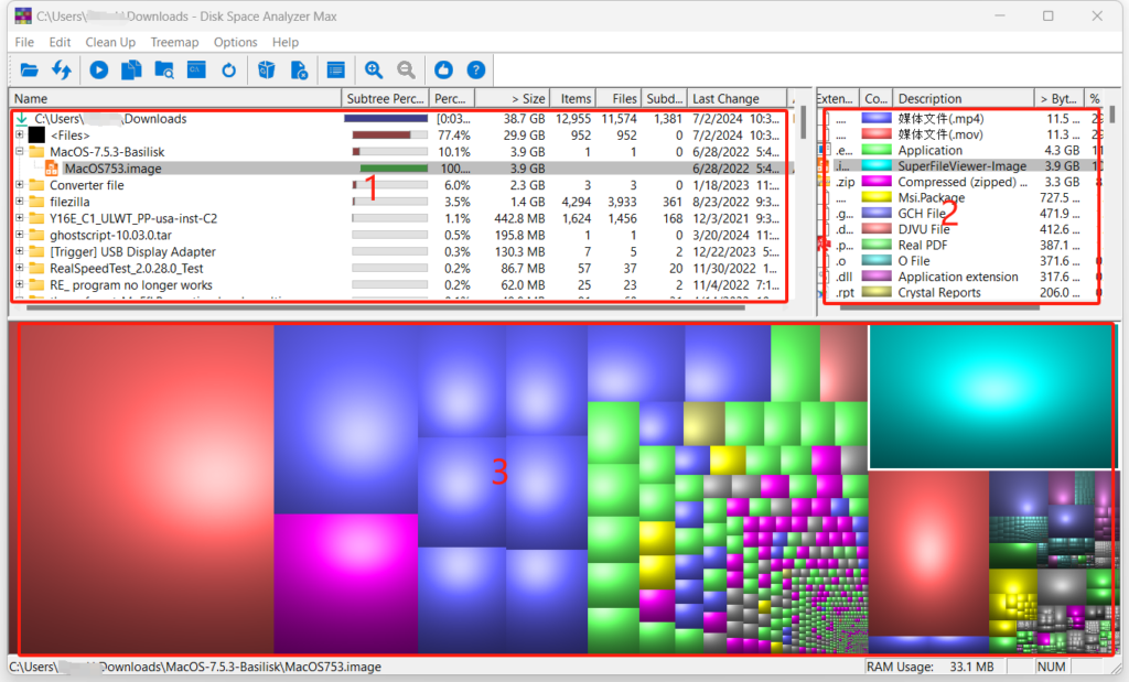
After scanning, the tool displays the results to you in the main UI. The layout of the main UI has three parts: file list, extension list and the treemap.

File List Panel
File list panel (marked as 1 in the image above) is located at the left top of the main UI. It shows you the detailed information of the folders and files.
Extension List Panel
Extension List Panel (marked as 2 in the image above) is located at the right top of the main UI. It shows you the detailed information of the file extension names.
Treemap Panel
The treemap panel (marked as 3 in the image above) is located at the bottom part of the main UI. In the treemap, each folder and file is represented by a rectangle. The rectangle’s size reflects the size of the folder or file that it represents. That said, the larger the rectangle, the large the folder or file that it represents. The rectangle’s color reflects the extension of the file (if it is a file).
How Do These Three Parts Work Together?
File list panel, extension list panel and the treemap panel are not isolated. Instead, they work together. When you select a folder or file in the file list panel, the rectangle representing this folder or file in the treemap panel will be automatically selected too and the corresponding extension (if it’s a file) will also be selected automatically. When you select a extension in the extension list panel, all the rectangles representing the files of this file extension will be automatically selected in the treemap panel. When you select a rectangle in the treemap panel, the folder or file it represents will be automatically selected in the file list panel and the extension will be automatically selected in the extension list panel.
Pages: 1 | 2 | 3 | 4